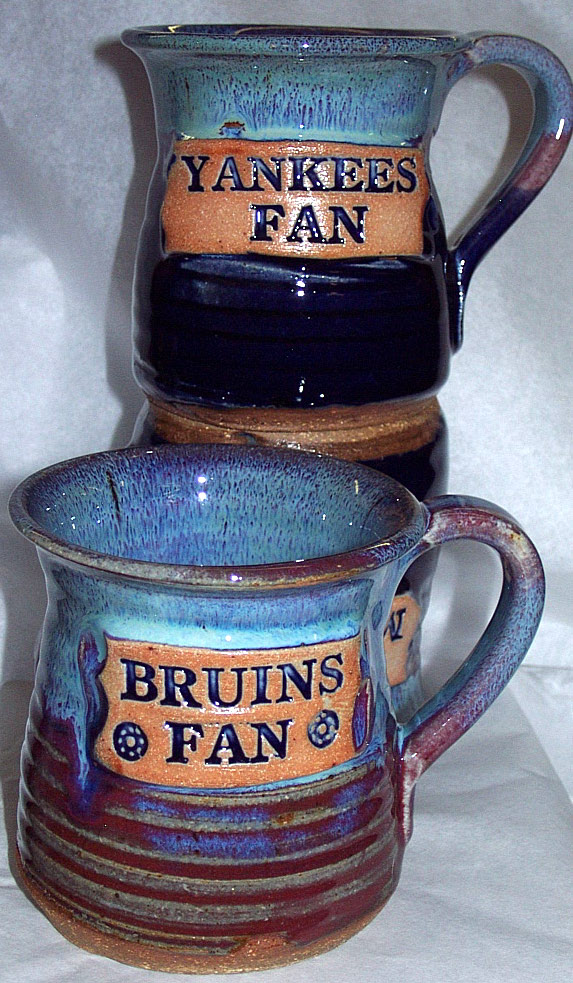
these mugs are really neat. the color variation is really cool. and where they put the text in looks cool also. it looks like they went through alot of time to do this and it paid off.
these pots or whatever they are is somewhat cool. i like the bottom left the most. the color they used is sweet. and once again the text looked hard to put on and i think they put alot of time into this.


You've made some really nice selections for research. Let's start turning the research into pots!
ReplyDelete