Friday, February 20, 2009

pottery with text


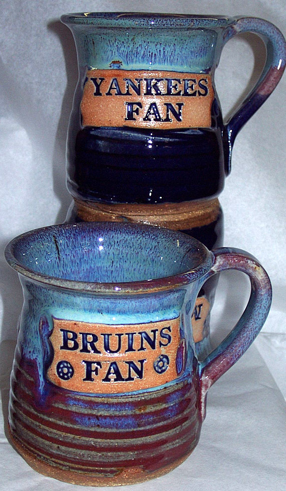
these mugs are really neat. the color variation is really cool. and where they put the text in looks cool also. it looks like they went through alot of time to do this and it paid off.


these pots or whatever they are is somewhat cool. i like the bottom left the most. the color they used is sweet. and once again the text looked hard to put on and i think they put alot of time into this.


this is a neat looking pot in general but by adding this sweet surface texture i think it adds alot to this pot. the little pumps make it look alot better than without them.


i'm really not a fan of this. i like the suface texture and the design he put on it but the pottery in general isnt that great. there is not much too it. nothing unique that puts it apart from other art work.


i picked this pot because i liked the shape of it and i liked the variation of colors. i also think the handle is pretty cool as well.


i think the handles are unique, it isnt the norm. its not something you see everyday. i also like how the blue and the purple slowly meet and as one color becomes full the other goes away.


i like the mix of colors that are combined in this mug. the type of class is different from the rest and i think that it makes the mug alot better than just one color.